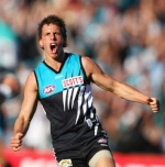
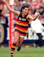
| | The Crows new logo |  |
|
+5Hawthorn2010 Daniel S TealDevils Falcon95 Chris L 9 posters |
| Author | Message |
|---|
Chris L

Posts : 130
Age : 32
Join date : 2009-12-30
| Subject: The Crows new logo  Wed Dec 30, 2009 10:39 pm Wed Dec 30, 2009 10:39 pm | |
| What is up with their logo i preferred the old one the new one looks shocking no offense to crow supporters.
what do you think of Adelaide Crows new logo? | |
|
| | |
Falcon95

Posts : 161
Age : 28
Join date : 2009-12-29
| | Subject: Re: The Crows new logo Thu Dec 31, 2009 7:50 am | |
| | |
|
| | |
TealDevils
Posts : 49
Age : 28
Join date : 2009-12-26
| | Subject: Re: The Crows new logo Thu Dec 31, 2009 10:03 am | |
| I don't like it at all. Makes the crows look more like pansies as they already are  And their new away guernsey is a stinker as well... | |
|
| | |
Daniel S

Posts : 113
Age : 32
Join date : 2009-12-30
| | Subject: Re: The Crows new logo Thu Dec 31, 2009 11:10 am | |
| i gotta say the new logo doesn't impress me, they should of just stuck with the old one | |
|
| | |
Hawthorn2010

Posts : 29
Age : 33
Join date : 2009-12-30
| | Subject: Re: The Crows new logo Thu Dec 31, 2009 11:14 am | |
| To be honest they practically tried to copy hawthorns one. Except ours looks way better  | |
|
| | |
Falcon95
Posts : 161
Age : 28
Join date : 2009-12-29
| | Subject: Re: The Crows new logo Thu Dec 31, 2009 11:42 am | |
| - Hawthorn2010 wrote:
- To be honest they practically tried to copy hawthorns one. Except ours looks way better
copied? Have you noticed that you guys have a Hawk and they have a crow lol. Same style, yes but all logos are headed that way | |
|
| | |
Hawthorn2010
Posts : 29
Age : 33
Join date : 2009-12-30
| | Subject: Re: The Crows new logo Thu Dec 31, 2009 11:55 am | |
| - Falcon95 wrote:
- Hawthorn2010 wrote:
- To be honest they practically tried to copy hawthorns one. Except ours looks way better
copied? Have you noticed that you guys have a Hawk and they have a crow lol. Same style, yes but all logos are headed that way Yeah, I know one is a hawk and one is a crow but I think Adelaide just swapped there head around and pointed it down abit to not make it look like hawks lol. Then again most teams are changing there logos. I mean look at Brisbanes. | |
|
| | |
Falcon95
Posts : 161
Age : 28
Join date : 2009-12-29
| | Subject: Re: The Crows new logo Thu Dec 31, 2009 12:25 pm | |
| - Hawthorn2010 wrote:
- Falcon95 wrote:
- Hawthorn2010 wrote:
- To be honest they practically tried to copy hawthorns one. Except ours looks way better
copied? Have you noticed that you guys have a Hawk and they have a crow lol. Same style, yes but all logos are headed that way
Yeah, I know one is a hawk and one is a crow but I think Adelaide just swapped there head around and pointed it down abit to not make it look like hawks lol. Then again most teams are changing there logos. I mean look at Brisbanes. yeah thats my point, all logos are headed in this direction | |
|
| | |
twentyone.

Posts : 91
Join date : 2009-12-29
| | Subject: Re: The Crows new logo Thu Dec 31, 2009 6:16 pm | |
| This is just shocking.  TO  | |
|
| | |
TheFeldster
Posts : 39
Age : 32
Join date : 2009-12-27
| | Subject: Re: The Crows new logo Fri Jan 08, 2010 5:09 pm | |
| Going against the flow here, but I think it's alright. There's nothing wrong with it  Bit of change never hurt anyone. Not mad keen on the stupid white jumpers that all the teams, including the Crows, and jumping on board with. I think they're dull and boring, to be frank. | |
|
| | |
EIMERS !!!
Posts : 55
Age : 33
Join date : 2010-01-03
| | Subject: Re: The Crows new logo Fri Jan 08, 2010 7:34 pm | |
| the new logo is shit, their old one was one of the best logos in the league, god i hope ours never change | |
|
| | |
cyclops
Posts : 13
Join date : 2009-12-31
| | Subject: Re: The Crows new logo Wed Jan 13, 2010 9:49 pm | |
| It looks more like a demented cockie than a crow. But atleast it completes the set, bad song bad gurnsey, and a bad logo. | |
|
| | |
Sponsored content
| | Subject: Re: The Crows new logo | |
| |
|
| | |
| | The Crows new logo | |
|
